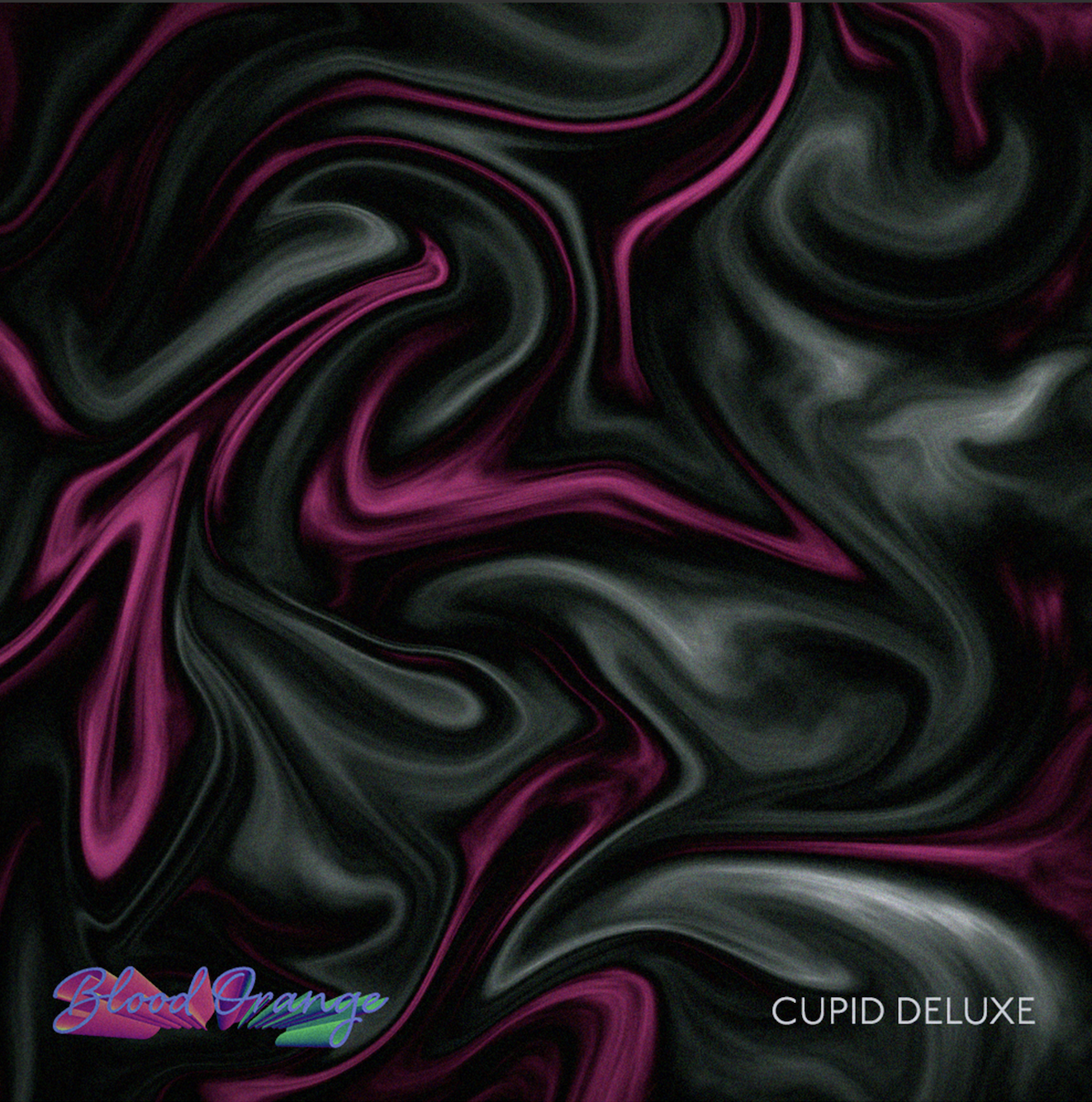
Blood Orange Rebrand
I chose to rebrand iconic artist, Blood Orange (Dev Hynes), as his music was foundational to my years of growing and navigating. In his legendary album, Cupid Deluxe, he discusses universal raw emotions of heartbreak and being okay with having no control over everything.
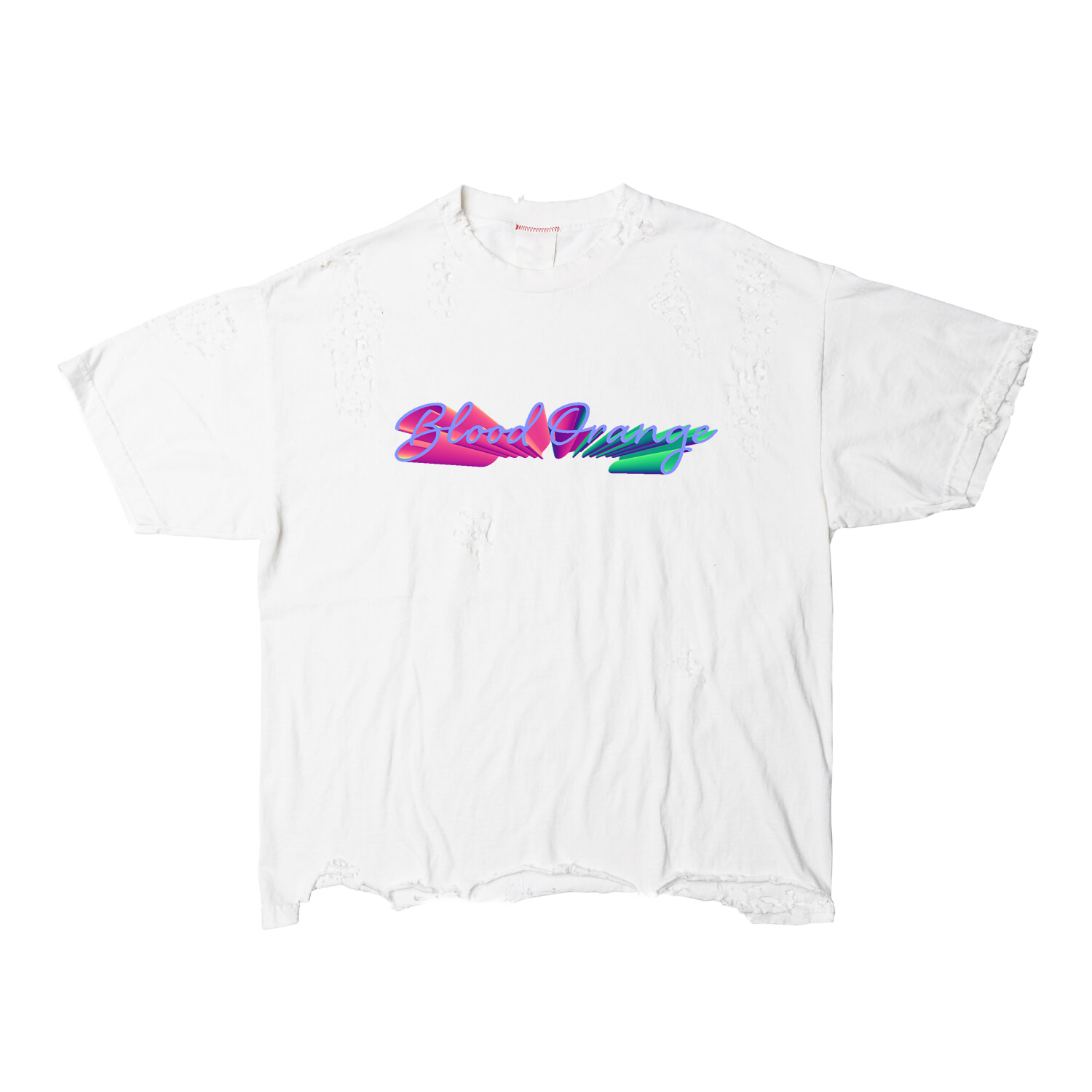
I felt that the music needed to be more reflective in his branding. He has the ability to give us softness, vulnerability, and androgyny through unique, beautifully crafted songs. He’s also skilled in meshing various genres of music in a delicate way and I wanted his branding to reflect this.
My design brings lightness and levity to Blood Orange, an artist who is known to get very vulnerable and open in his music, oftentimes hitting on a lot of darkness in his life. I showcase his multidimensionality as an artist. With his lyrics that speak towards vulnerability and tenderness and his ability to contrast that with his synthy pop mixed with r&b sounds, this design encapsulates how he balances the two together.
My visuals speak to this with the vibrant colorways contrasting with the dark. The vivid colors represent the instrumentals: the various genres he beautifully is able to mesh together, and the somber dark colors represent the tender, raw, emotional lyrics.